Blue and white home decor is one of the easiest ways to make a room feel polished without making it feel fussy. The combination can read coastal, traditional, farmhouse, modern, or transitional depending on the shades, patterns, and materials you choose. That flexibility is what makes it so useful. pink home decor accessories offers more detail on this point.
If you are trying to decide whether this palette will work in your home, the short answer is yes for most spaces. The real question is how much blue to use, which shades to pair with white, and how to keep the look from feeling flat or overly themed.
When blue and white home decor works best
This color pairing is especially effective when you want a space to feel clean, calm, and visually organized. White keeps the room bright and open, while blue adds structure, contrast, and personality. Together, they can soften a busy layout or bring cohesion to an otherwise mixed room.
It tends to work particularly well in spaces that already receive good natural light, but it is not limited to bright homes. In darker rooms, deeper blues can add richness while white prevents the space from feeling heavy. In smaller rooms, the palette can make the space feel more intentional if you keep the contrast balanced.
One overlooked benefit is how forgiving the palette can be over time. Blue and white decor often adapts well to seasonal changes, style updates, and new furniture finishes. That makes it a smart choice if you prefer a look that can evolve rather than a highly specific trend-driven scheme.
Step-by-step criteria for choosing the right blue and white look
1. Decide the mood first
Before picking pillows, curtains, or wall color, decide what the room should feel like. Blue and white can lean in several directions:
- Calm and airy: soft blues, crisp white, light wood, minimal pattern
- Classic and tailored: navy, bright white, structured stripes, more formal fabrics
- Relaxed and coastal: weathered blues, creamy white, natural textures, casual patterns
- Fresh and modern: cleaner blues, sharp contrast, simple shapes, less ornament
This first decision matters because the same palette can look dramatically different depending on tone and texture. A room full of nautical motifs will feel very different from a room using blue and white in a restrained, abstract way.
2. Choose the right shade of blue
Not every blue behaves the same way. Pale blue can feel soft and breezy, but it may disappear in a room with a lot of daylight. Navy creates stronger definition, yet too much of it can make a space feel heavier if the room lacks contrast. Mid-tone blues sit in the middle and often work well when you want the palette to feel balanced.
Consider the other materials in the room too. Brass, warm wood, and woven textures can soften cooler blues. Chrome, black accents, and glass can make the scheme feel sharper and more modern. The goal is not to find the “best” blue in general, but the blue that fits your room’s light, size, and existing finishes.
3. Decide how much white you need
White is not just a background color in this palette; it controls the overall intensity. Too little white, and the room may feel visually dense. Too much white, and the blue elements can seem scattered or underdeveloped. In practice, many rooms look best when white acts as the base and blue appears as the accent, but that is not a rule. blue and white color palette ideas offers more detail on this point.
If your walls, trim, or major upholstered pieces are already white or off-white, you can introduce blue through rugs, art, bedding, lamps, or ceramics. If your room already has a lot of blue, white can enter through curtains, tableware, throw blankets, or negative space in the styling. complete guide to gold floor lamp offers more detail on this point.
4. Pay attention to undertones
This is where many people get stuck. Blue and white decor may seem simple, but undertones matter. A blue with gray in it will feel quieter than a bright primary blue. A white with cream undertones will feel warmer than a stark white. Mixing the wrong undertones can make the room look slightly off, even if each piece looks fine on its own.
Instead of trying to make everything match exactly, aim for harmony. A cooler blue can still work with a soft white if you repeat similar tones elsewhere in the room. A warmer blue can pair well with creamy white if you also introduce wood, linen, or other natural textures.
How to use the palette room by room
Living room
Blue and white living rooms work best when there is enough variety to keep the palette from feeling staged. A sofa in white or light neutral fabric can anchor the space, while blue appears in pillows, artwork, a rug, or an accent chair. If you want more visual interest, use pattern in a controlled way, such as one striped element, one floral element, and one solid element.
To avoid a flat look, mix textures. Linen, cotton, ceramic, wood, woven baskets, and matte finishes help the palette feel layered rather than sterile. If the room is formal, stronger contrast and cleaner lines may suit it. If it is family-focused, choose fabrics and surfaces that are easier to live with and maintain.
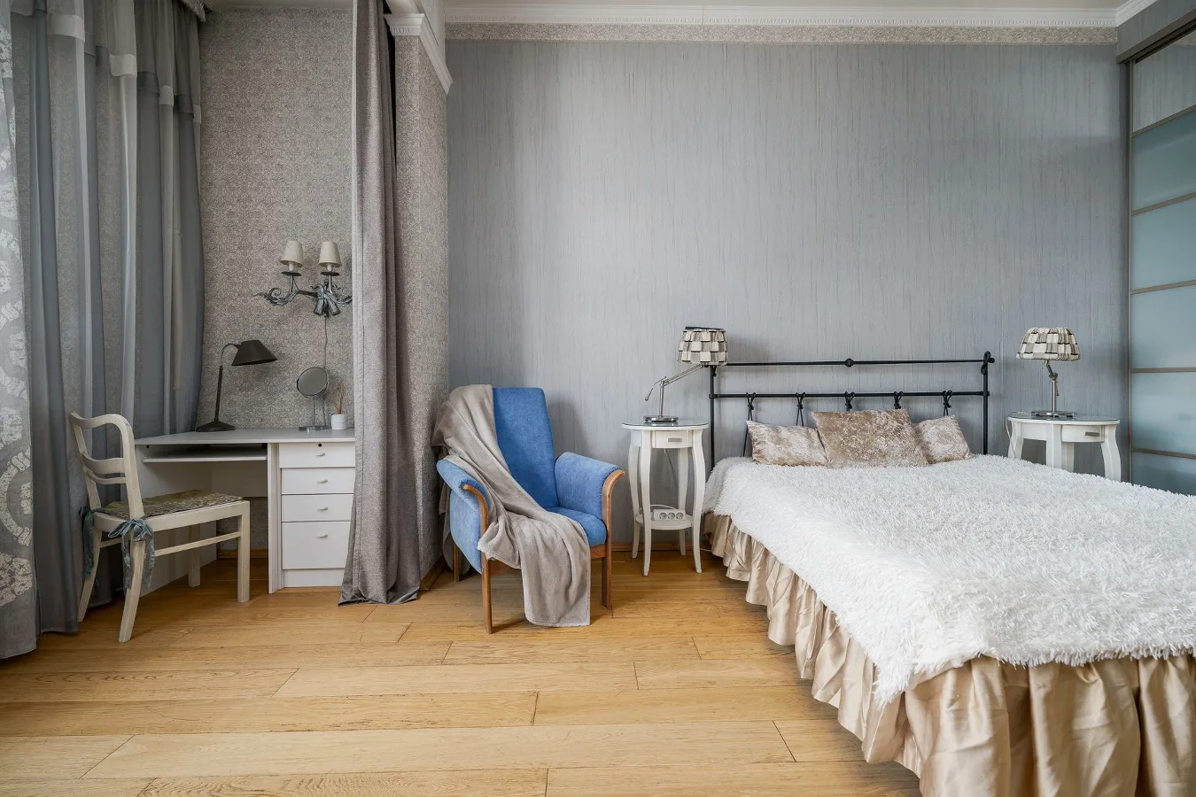
Bedroom
Blue and white bedding is one of the most practical ways to use the palette because it immediately changes the tone of the room. Soft blue bedding can make a bedroom feel restful, while white bedding with blue accents keeps the space bright and crisp. Adding just one patterned layer, such as a quilt, duvet cover, or decorative pillow, is often enough.
Bedrooms also benefit from restraint. Too many competing patterns can make the room feel busy, especially if the furniture is already visually detailed. A more relaxed approach often works better: a simple base, one or two blue accents, and small touches of natural texture.
Kitchen
Blue and white kitchen decor often shows up in backsplash tile, dishware, towels, runners, or cabinet color. This palette can feel classic in a kitchen because it connects easily with ceramic, porcelain, and painted finishes. It also works well when you want the kitchen to feel clean without becoming cold.
Because kitchens already have a lot of functional detail, it usually helps to keep decorative elements focused. If your cabinets or tile are the main blue and white features, let accessories stay simpler. If the kitchen itself is neutral, patterned dishware or textiles can add the color story without a remodel.
Bathroom
Bathrooms are a natural fit for blue and white because the palette suits a fresh, clean atmosphere. Towels, shower curtains, tile accents, soap dispensers, and artwork can all support the look. In a small bathroom, white should usually dominate so the room does not feel crowded.
One practical point: bathroom decor needs to hold up to moisture and frequent cleaning. Choose materials and finishes that are easy to care for, and avoid overloading the room with delicate accessories that may not be useful for long.
Patterns, textures, and materials that make the palette feel finished
Blue and white decor often depends on more than color alone. Without texture, the look can become visually thin. Without pattern, it can lose character. The right balance is usually what makes the palette feel complete.
Patterns that tend to work well:
- stripes for a crisp, classic effect
- florals for a softer or more traditional look
- geometric prints for a modern edge
- gingham or checks for a casual feel
- porcelain-inspired motifs for a collected, timeless look
Materials that help ground the palette:
- linen for a relaxed, slightly lived-in feel
- cotton for everyday flexibility
- ceramic for decorative accents and table settings
- wood for warmth and contrast
- rattan or woven fibers for texture and softness
A common misconception is that blue and white decor always has to feel coastal. It does not. Coastal styling is only one interpretation. A tailored navy-and-white scheme can feel formal. A soft blue-and-white combination can feel cottage-like. Strong geometry can push the palette into a more modern direction.
Checklist for styling a blue and white room
- Choose the mood before buying pieces
- Decide whether blue or white will dominate
- Use at least one texture beyond paint or print
- Repeat the same blue in a few places for cohesion
- Mix solids and patterns instead of using only one or the other
- Balance cool tones with wood, brass, or natural fibers if needed
- Keep large furniture pieces simple if the patterns are bold
- Use white space intentionally so the room can breathe
Common mistakes to avoid
The biggest mistake is treating blue and white as a single style rather than a flexible palette. That often leads to rooms that feel overly themed. Another common issue is using too many different blues without a clear plan. A pale dusty blue, a bright cobalt, and a dark navy can work together, but only if there is a strong organizing idea.
People also sometimes rely too heavily on white and forget texture. If every surface is smooth, bright, and visually similar, the room can feel unfinished. The opposite problem happens too: too much pattern without enough rest points makes the room feel restless.
Another practical constraint is maintenance. White fabrics and finishes may look beautiful, but they can show wear more quickly in active households. If your space gets heavy use, choose washable covers, durable textiles, or white elements in places that are easier to refresh.
Useful alternatives if blue and white feels too cold or too common
If you like the clarity of blue and white but want a softer result, consider pairing blue with ivory, oatmeal, taupe, or warm wood tones. That keeps the palette approachable without losing its freshness. If you want more contrast, add black accents in small amounts for definition.
For a more modern variation, try navy with warm white and very limited pattern. For a more relaxed version, use faded denim blue, cream, and natural textures. If you are trying to avoid a coastal look, skip anchors, shells, and obvious seaside imagery. The palette can stand on its own without any literal theme.
Examples of approachable blue and white combinations
- Bedroom: white bedding, pale blue throw, natural wood nightstand, simple striped pillow
- Living room: ivory sofa, navy cushions, blue artwork, ceramic lamp, woven basket
- Kitchen: white cabinets, blue-and-white dishware, linen runner, wood cutting boards
- Bathroom: white tile, blue towels, blue-framed art, brushed metal hardware
- Entryway: white console, blue ceramic vase, patterned runner, framed prints
These combinations work because they spread the color across different surfaces instead of forcing it into one oversized statement piece. That usually makes the palette feel more natural and less decorative for decoration’s sake.
Frequently asked questions
Does blue and white home decor only suit coastal style?
No. Coastal style is one option, but the palette also works in traditional, farmhouse, transitional, and modern interiors depending on the shades and materials you choose.
What shade of blue is easiest to decorate with?
Soft to mid-tone blues are often the easiest because they are adaptable. Navy is also versatile, but it needs enough white and lighter texture to keep the space balanced.
How do I keep blue and white decor from feeling cold?
Add warmth through wood, linen, woven textures, brass, or creamier whites. A room with only blue, white, and hard surfaces can feel cooler than intended.
Can I mix patterns in a blue and white room?
Yes, and it often improves the look. The key is varying the scale of the pattern and keeping the overall palette controlled so the room stays cohesive.
Is blue and white a good choice for small rooms?
Yes, especially if white is the dominant color. In small rooms, use blue as an accent or keep the darker shades limited so the space still feels open.
Blue and white home decor remains popular because it solves a practical design problem: how to make a room feel fresh, calm, and finished without locking it into one narrow style. If you choose the right blue, control the amount of white, and add enough texture, the palette can feel timeless instead of predictable.